Color & Styling
Clothing Color Matching Guide: Build Better Outfit Palettes
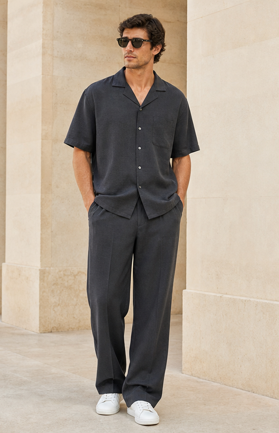
Color matching becomes easier when every shade has a clear role. Instead of memorizing rigid rules, build an outfit around a dominant color, a supporting neutral, and an optional accent. This simple hierarchy works for minimalist clothing, expressive streetwear, business outfits, occasion dressing, and almost every wardrobe in between.
Start with value before hue
Value describes how light or dark a color appears. An outfit can feel balanced even with several hues when the light and dark areas create a clear structure. Dark trousers with a lighter top draw attention upward, while a tonal dark look creates a long uninterrupted line. If a combination feels wrong, view it in grayscale or squint at the mirror. The issue may be the distribution of light and dark rather than the colors themselves.
Use the 60-30-10 color approach
A practical starting point is to let one color occupy most of the outfit, a second support it, and a third appear as a small accent. The proportions do not need to be exact. A navy suit, cream shirt, and burgundy shoe follow the same logic as blue denim, a white tee, and a green bag. Limiting the number of competing colors makes the silhouette easier to read and gives accessories a more intentional role.
Build tonal outfits with texture
Tonal dressing combines neighboring shades of one color family, such as ivory, oat, camel, and chocolate. The palette feels calm, but it needs variation in texture and shape to avoid looking flat. Pair smooth cotton with knitwear, matte wool with leather, or fluid fabric with structured tailoring. Small differences in warmth and saturation make the outfit feel layered while preserving a polished visual direction.
Treat undertone as guidance, not a rule
Warm, cool, and neutral undertones can help explain why certain colors feel harmonious near the face, but personal preference and contrast matter just as much. Test colors in natural light and compare how they affect the appearance of skin, eyes, and hair. If a favorite shade feels too strong near the face, move it to trousers, shoes, or a bag. A personal color palette should expand confidence rather than restrict it.
Save combinations that already work
Photograph successful outfits and label the palette, occasion, and season. Patterns will emerge: perhaps navy works better than black, muted green combines with most of your neutrals, or silver accessories create the cleanest finish. These observations form a personal color system. An AI fashion stylist can then use those preferences with weather and occasion to suggest combinations that feel connected to your actual wardrobe.